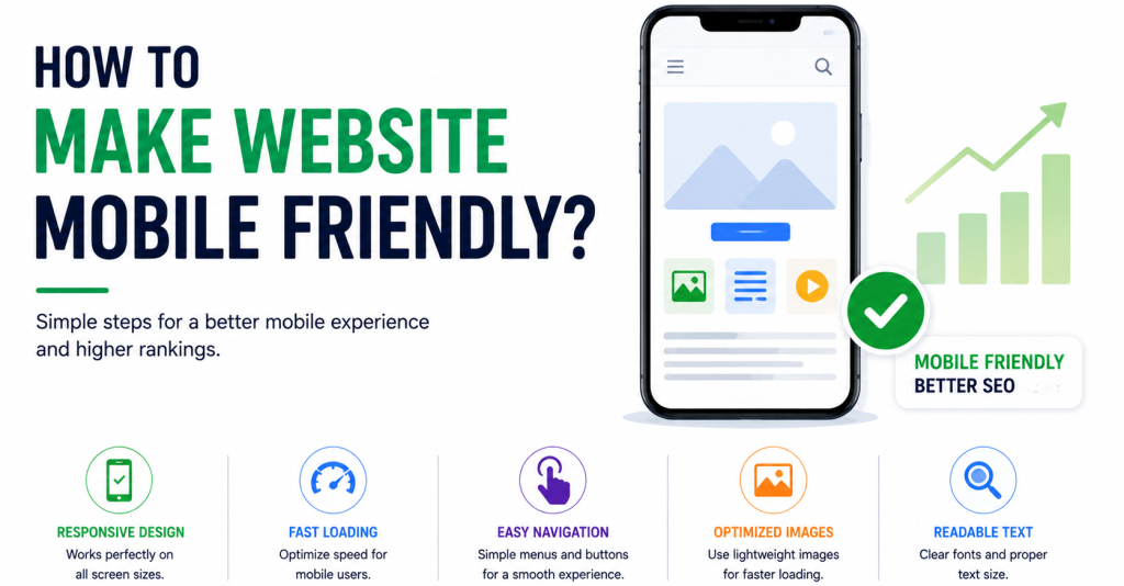
How To Make Website Mobile Friendly?
Today, most people use phones to search on Google, read blogs, shop online, watch videos, book services, and contact businesses. So, if your website does not work well on a mobile phone, many visitors may leave quickly. This can hurt your traffic, leads, sales, and SEO performance.
A mobile-friendly website means your website looks good, loads fast, and works smoothly on small screens like smartphones and tablets. Text should be easy to read, buttons should be easy to tap, images should fit the screen, and pages should not look broken.
For any business website, mobile friendliness is not optional anymore. It is a basic need. Google also uses mobile-first indexing, which means Google mainly checks the mobile version of your website for indexing and ranking..
At Topseolinks.com, we help businesses improve mobile SEO, technical SEO, page speed, content structure, and website performance so users and search engines can understand the website better.
What Does A Mobile-Friendly Website Mean?
A mobile-friendly website is a website that adjusts itself according to the user’s device screen. It should not force users to zoom in, scroll left and right, or struggle to click buttons.
For example, when someone opens your website on a mobile phone:
- The text should be clear and readable.
- The menu should open properly.
- Images should not go outside the screen.
- Buttons should have enough space.
- Forms should be easy to fill.
- Pages should load quickly.
- Important information should be easy to find.
A mobile-friendly website gives a smooth experience. It helps users stay longer, read more pages, and take action, such as calling your business, filling out a form, buying a product, or sending an inquiry.
Why Is Making A Website Mobile Friendly Important?
Mobile friendliness is important because users expect fast and easy browsing. If your website is hard to use on mobile, people may leave and visit your competitor’s website instead.
Mobile-friendly websites are also important for SEO. Google wants to show useful and easy-to-use pages to searchers. If your website is slow, hard to read, or broken on mobile, it may affect your rankings.
That is why mobile SEO plays an important role in improving user experience, search visibility, and website performance on smartphones and tablets.
Main Benefits Of A Mobile-Friendly Website
| Benefit | Simple Meaning | Why It Matters |
|---|---|---|
| Better user experience | Visitors can easily read and use your site | People stay longer |
| Better SEO support | Google can understand your mobile pages better | Helps ranking chances |
| More leads | Forms, calls, and buttons work properly | More users can contact you |
| Faster browsing | Pages open quickly on mobile | Less chance of users leaving |
| Better trust | Website looks professional | Users feel safer |
How To Make Website Mobile Friendly Step-By-Step?
1. Use Responsive Website Design
Responsive design means your website automatically changes its layout based on screen size. The same website can look good on desktop, tablet, and mobile.
This is one of the best ways to make a website mobile friendly because you do not need a separate mobile website. Instead, one website adjusts itself for all devices. A responsive design also supports better SEO because users can read, click, and move around the website easily on any device. For businesses that want expert help, Topseolinks.com provides Professional SEO Services to improve website structure, mobile usability, and search performance.
What Responsive Design Should Do
A responsive website should:
- Resize images according to screen size.
- Move columns into a single mobile-friendly layout.
- Make text readable without zooming.
- Keep buttons and links easy to tap.
- Show menus in a clean mobile format.
- Avoid content going outside the screen.
For example, on desktop, a website may show three service boxes in one row. But on mobile, those three boxes should appear one below another. This makes reading easier.
2. Improve Mobile Page Speed
Speed is one of the biggest parts of mobile friendliness. Many mobile users may not have very fast internet. If your website takes too long to load, they may leave before reading anything.
A slow website can also affect SEO performance.
Easy Ways To Improve Mobile Speed
You can improve mobile speed by:
- Compressing large images before uploading.
- Using modern image formats when possible.
- Removing unnecessary plugins.
- Reducing heavy scripts.
- Using browser caching.
- Using a good hosting provider.
- Cleaning unused CSS and JavaScript.
- Avoiding too many popups.
- Using lazy loading for images.
Mobile Speed Problems And Fixes
| Problem | What Happens | Easy Fix |
|---|---|---|
| Large images | Page becomes slow | Compress and resize images |
| Too many plugins | Website becomes heavy | Remove unused plugins |
| Poor hosting | Server responds slowly | Use better hosting |
| Heavy code | Browser takes longer to load page | Minify CSS and JavaScript |
| No caching | Same files reload again and again | Enable caching |
3. Make Text Easy To Read On Mobile
Text is one of the most important parts of a website. If users cannot read your content easily, they will not stay.
On mobile, text should not be too small. Users should not need to pinch and zoom. Paragraphs should also be short because long blocks of text look heavy on small screens.
Tips For Mobile-Friendly Text
Use these simple rules:
- Keep font size comfortable.
- Use short paragraphs.
- Add clear headings.
- Use bullet points where helpful.
- Keep enough space between lines.
- Avoid tiny text in buttons and menus.
- Do not place text too close to screen edges.
Good mobile content should feel light and easy. A 5th grade student should be able to read and understand the main message without feeling confused.
4. Use Large And Clear Buttons
Mobile users tap with their fingers, not a mouse. So buttons must be big enough and easy to click.
Small buttons create problems. Users may tap the wrong link, get frustrated, and leave. This is especially important for contact forms, call buttons, add-to-cart buttons, and service inquiry buttons.
Good Mobile Button Practices
Your buttons should:
- Be large enough to tap easily.
- Have clear text like “Call Now,” “Get Quote,” or “Contact Us.”
- Have enough space around them.
- Use simple words.
- Be placed where users can find them quickly.
- Work properly on all mobile devices.
For business websites, call buttons are very important. Many mobile visitors want quick action. They may not want to search for your phone number. A clear call button can help you get more leads.
5. Keep The Website Navigation Simple
Navigation means the menu and links that help users move around your website. On mobile, navigation must be very simple.
A desktop menu with many items may not work well on a small screen. That is why many websites use a mobile menu, also called a hamburger menu.
Mobile Navigation Should Be
- Simple
- Clean
- Easy to open
- Easy to close
- Not too crowded
- Organized by important pages
- Fast to load
For example, if you run a service website, your mobile menu can include:
- Home
- About
- Services
- Blog
- Contact
Do not add too many unnecessary menu items. Too many choices can confuse visitors.
6. Optimize Images For Mobile
Images can make your website beautiful, but they can also slow it down if not optimized. A mobile-friendly website should use images that look clear but do not make pages heavy.
Image Optimization Tips
- Use the right image size.
- Compress images before uploading.
- Add descriptive alt text.
- Avoid using huge banner images on mobile.
- Use lazy loading for below-the-fold images.
- Make sure images resize correctly on small screens.
Image SEO is also useful because search engines need help understanding images. Proper image optimization for SEO can improve page speed, user experience, and search visibility.
7. Avoid Annoying Popups
Popups can be useful, but on mobile they can become irritating. If a popup covers the full screen and is hard to close, users may leave.
Google also cares about user experience. So, avoid popups that block the main content, especially when the user opens the page.
Better Popup Practices
Use popups carefully:
- Do not show popups immediately.
- Make the close button easy to tap.
- Keep popup size small.
- Avoid covering important content.
- Use simple offers or messages.
- Test popups on mobile before publishing.
A popup should help the user, not disturb them.
8. Make Forms Easy To Fill
Forms are used for contact, signup, booking, inquiry, checkout, and lead generation. On mobile, forms should be short and simple.
If your form has too many fields, users may leave before submitting it.
Mobile Form Best Practices
| Form Element | Mobile-Friendly Practice | Why It Helps |
|---|---|---|
| Name field | Keep it simple | Easy to fill |
| Phone field | Use number keyboard | Faster typing |
| Email field | Use email keyboard | Reduces mistakes |
| Message field | Keep optional if possible | Less pressure on user |
| Submit button | Make it large and clear | Easy to tap |
Ask only for information you truly need. For many service businesses, name, phone, email, and message are enough.
9. Improve Core Web Vitals
Core Web Vitals are Google’s page experience signals. They help measure how fast, stable, and smooth your page feels for users.
A mobile-friendly website should perform well in Core Web Vitals because mobile users expect fast loading and smooth browsing.
Important Core Web Vitals In Simple Words
- Largest Contentful Paint means how fast the main content loads.
- Interaction to Next Paint means how quickly the page responds after a user clicks or taps.
- Cumulative Layout Shift means whether things move around suddenly while the page is loading.
If your page loads slowly, responds late, or jumps while users are reading, it creates a bad mobile experience.
10. Use Mobile-Friendly Content Layout
A good mobile layout is clean and easy to follow. Users should not feel lost.
Mobile users often scan content quickly. They look for headings, short points, images, buttons, and useful answers. So your content should be organized.
Mobile Content Layout Tips
Use:
- Short paragraphs
- Clear headings
- Bullet points
- Simple tables
- Helpful images
- Strong call-to-action buttons
- Proper spacing
- Easy-to-read fonts
Avoid:
- Very long paragraphs
- Too many ads
- Sidebars that squeeze content
- Tiny buttons
- Wide tables that break the screen
- Large images without resizing
11. Check Website On Different Devices
Do not check your website only on desktop. A website can look perfect on a laptop but broken on a mobile phone.
You should test your website on:
- Android phones
- iPhones
- Tablets
- Chrome browser
- Safari browser
- Different screen sizes
Testing helps you find real problems. Maybe your menu is not opening. Maybe your button is too small. Maybe your form is difficult to use. These small issues can reduce leads and sales.
12. Use Google Search Console
Google Search Console helps you understand how Google sees your website. It can show indexing issues, mobile usability problems, and performance data.
With Google Search Console, you can check:
- Which pages are indexed.
- Which pages have errors.
- Which keywords bring traffic.
- Which pages get clicks.
- Which pages may need improvement.
For mobile SEO, this tool is very useful because it helps you find technical issues that may not be visible at first.
13. Keep Your Website Design Simple
A simple website is usually better for mobile users. Heavy design, too many animations, auto-playing videos, and complex layouts can slow down the website.
Simple does not mean boring. It means clean, clear, and easy to use. A simple mobile design helps visitors understand your business faster and take action without confusion. If your website needs a clean, modern, and mobile-friendly layout, Topseolinks.com offers Professional Web Design Services to help your website look better and work smoothly on all devices.
A Good Mobile Design Should Have
- Clear logo
- Simple menu
- Easy-to-read text
- Fast-loading images
- Clear service sections
- Visible contact buttons
- Clean spacing
- No confusing design elements
When users understand your website quickly, they are more likely to trust your business.
How Topseolinks.com Can Help Make Your Website Mobile Friendly
Topseolinks.com helps businesses improve websites for users and search engines. A mobile-friendly website needs design, speed, SEO, technical checks, content structure, and user experience improvements.
Our team can help you with:
- Mobile SEO audit
- Technical SEO checks
- Website speed improvement suggestions
- Core Web Vitals improvement
- On-page SEO structure
- Internal linking guidance
- Image optimization suggestions
- Mobile usability review
- Search Console issue analysis
- SEO-friendly content planning
A mobile-friendly website is not just about design. It is also about SEO, speed, structure, and user trust. That is why professional SEO support can help your website perform better.
Mobile-Friendly Website Checklist
Before publishing or updating your website, use this simple checklist.
| Checklist Item | Done? |
|---|---|
| Website adjusts to mobile screen size | Yes / No |
| Text is readable without zooming | Yes / No |
| Buttons are easy to tap | Yes / No |
| Images fit the screen | Yes / No |
| Page loads fast on mobile | Yes / No |
| Menu opens and closes properly | Yes / No |
| Forms are short and easy | Yes / No |
| No annoying full-screen popups | Yes / No |
| Core Web Vitals are checked | Yes / No |
| Website tested on real mobile devices | Yes / No |
Common Mistakes To Avoid
Many websites lose mobile visitors because of simple mistakes. These mistakes can be fixed with proper checking.
Avoid These Mobile Website Mistakes
- Using tiny text
- Using images that are too large
- Having buttons too close together
- Making users scroll sideways
- Adding too many popups
- Keeping forms too long
- Using slow hosting
- Ignoring mobile speed
- Not testing on real phones
- Designing only for desktop
Even one small issue can make users leave. For example, if your contact button does not work on mobile, you may lose many leads.
Make Your Website Mobile Ready With Topseolinks.com
Making a website mobile friendly means making it easy for phone users to read, click, scroll, contact, and buy. It also supports SEO because search engines want to show websites that give visitors a better and smoother experience.
To make your website mobile friendly, focus on responsive design, fast loading speed, readable text, clear buttons, simple navigation, optimized images, short forms, and strong technical SEO. These small improvements can help users stay longer and take action faster.
If your website is slow, hard to use on mobile, or not ranking well, Topseolinks.com can help you improve mobile SEO, technical SEO, Core Web Vitals, and website structure in a simple and professional way.
Ready to make your website mobile friendly and SEO-ready?
Contact Us today and let the Topseolinks.com team help you build a better mobile experience for your visitors.
FAQs
What does mobile friendly website mean?
A mobile friendly website means a website that works well on mobile phones and tablets. The text is easy to read, buttons are easy to tap, images fit the screen, and users do not need to zoom in again and again.
Why is a mobile friendly website important for SEO?
A mobile friendly website is important for SEO because Google mainly checks the mobile version of a website for indexing and ranking. If your mobile website is slow or difficult to use, it can affect user experience and search performance.
How can I check if my website is mobile friendly?
You can check your website on different mobile phones, tablets, and browsers. You can also use Google Search Console to find mobile usability and indexing issues.
What is the best way to make a website mobile friendly?
The best way is to use responsive design, improve page speed, compress images, make text readable, use large buttons, simplify navigation, and test the website on real mobile devices.
Does page speed matter for mobile SEO?
Yes, page speed matters a lot for mobile SEO. If your website loads slowly, users may leave quickly. A faster website gives a better user experience and supports better SEO performance.
Can Topseolinks.com help with mobile SEO?
Yes, Topseolinks.com can help with mobile SEO, technical SEO, Core Web Vitals, website audits, content structure, and page speed improvement guidance.