Is Mobile SEO Important?
Is Mobile SEO Important? Yes, mobile SEO is very important because many people use mobile phones to search, read, shop, compare services, and contact businesses online. Mobile SEO means improving your website so it works well on phones and can be understood properly by search engines. If your website is slow, hard to read, or difficult to use on mobile, visitors may leave quickly and your SEO performance may suffer.
Google uses the mobile version of a site’s content, crawled with the smartphone agent, for indexing and ranking. This is called mobile-first indexing, and Google strongly recommends having a mobile-friendly site.
At Topseolinks.com, we help businesses improve mobile SEO, website speed, technical SEO, mobile design, and user experience so their websites can perform better for both users and search engines.
Want expert SEO support for your website? Start with our special offer: Free SEO for 1st Month
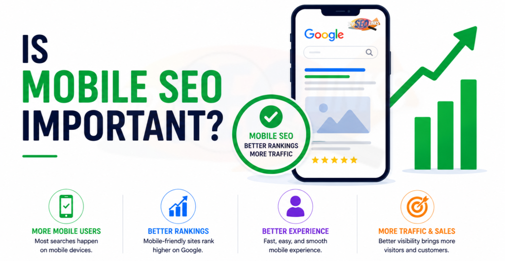
Why Mobile SEO Matters for Every Website
Mobile SEO matters because your website is often seen first on a phone. People may search while traveling, shopping, sitting at home, comparing companies, or looking for quick answers. If your website does not work well on mobile, you may lose traffic, leads, and sales.
A mobile user wants everything to be simple. The page should open fast. Text should be easy to read. Buttons should be easy to tap. Menus should be simple. Forms should not feel difficult. Images should fit the screen. Important content should not be hidden.
Mobile SEO helps your website become better for:
- Mobile visitors
- Google crawling and indexing
- Local searches
- Ecommerce shopping
- Service inquiries
- Lead generation
- Page experience
- Website trust
- Long-term SEO growth
A good mobile website does not only help rankings. It also helps people use your site without stress.
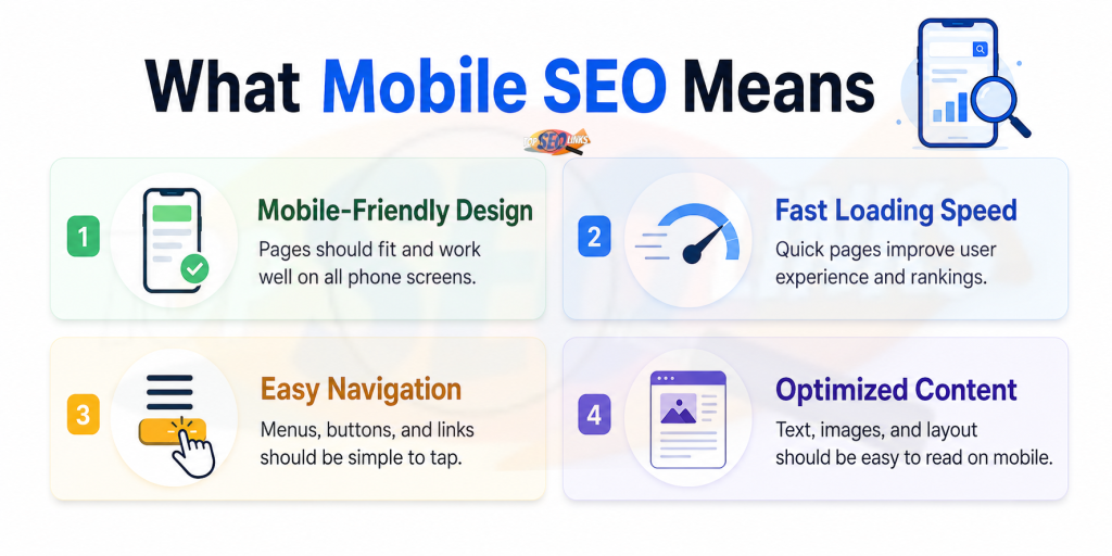
What Mobile SEO Means
Mobile SEO means optimizing your website for people who visit from mobile devices. It also means making sure search engines can crawl, read, and understand your mobile pages correctly.
Mobile SEO includes many parts, such as:
- Mobile-friendly design
- Fast mobile page speed
- Easy-to-read content
- Tap-friendly buttons
- Simple navigation
- Proper mobile indexing
- Image optimization
- Clean technical SEO
- Matching mobile and desktop content
- Mobile-friendly forms
- Core Web Vitals improvement
- Good user experience
Think of mobile SEO like making your shop easy to enter from a small door. If the door is too small, the lights are dim, and the counter is hard to reach, customers will not enjoy the shop. A mobile website is similar. It must be easy to open, read, click, and use.
Mobile SEO and Mobile-First Indexing
Mobile SEO became even more important because of mobile-first indexing. This means Google mainly uses the mobile version of your website to index and rank your pages.
If your desktop page has complete content but your mobile page has missing content, Google may not see the full value of the page. Google says mobile pages can have different design patterns like tabs or accordions, but the content should be equivalent to the desktop version because indexing comes from the mobile site.
For example, your desktop service page may include:
- Full service details
- FAQs
- Reviews
- Internal links
- Images
- Pricing details
- Contact form
But if the mobile page removes many of these items, Google and users may see a weaker page. That can hurt SEO.
For more details on this topic, you can read What Is Mobile-First Indexing
How Mobile SEO Helps Search Rankings
Mobile SEO helps search rankings by improving how users and search engines experience your website. Google ranking depends on many things, such as helpful content, search intent, backlinks, website structure, authority, and technical SEO. But mobile experience is also important because users need a website that works well on their phones.
Mobile SEO supports rankings because it helps with:
- Better mobile usability
- Faster loading
- Cleaner crawling
- Stronger page experience
- Lower user frustration
- Better engagement
- Complete mobile content
- Improved technical structure
Google’s page experience guidance says page experience can impact how a site ranks in Search results, and Core Web Vitals are part of understanding real-world user experience.
This means your mobile website should not only exist. It should be useful, fast, stable, and easy to use.
Mobile SEO and User Experience
User experience means how a person feels while using your website. If the mobile website is smooth, people may stay longer. If it is slow or confusing, they may leave.
A good mobile experience includes:
- Clear text
- Fast loading pages
- Easy scrolling
- Simple menus
- Large enough buttons
- Proper spacing
- Helpful content
- Quick forms
- Clear calls to action
- No annoying popups
- Stable layout
A bad mobile experience includes:
- Tiny text
- Slow pages
- Buttons too close together
- Content wider than the screen
- Hard-to-open menus
- Popups covering content
- Images loading slowly
- Forms that are hard to fill
- Pages jumping while loading
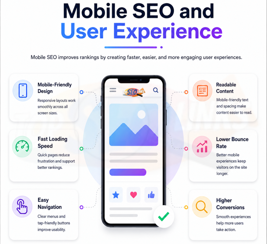
Mobile SEO improves user experience by making your website easier to use on small screens.
Mobile SEO and Page Speed
Mobile page speed is one of the most important parts of mobile SEO. Mobile visitors may use slower internet than desktop users. They may also use devices with different screen sizes and performance levels.
If your mobile page loads slowly, people may leave before seeing your content.
Slow mobile speed can hurt:
- Traffic value
- User experience
- Lead generation
- Product sales
- Form submissions
- Page engagement
- Brand trust
Google’s Core Web Vitals measure real-world user experience, including loading, responsiveness, and visual stability.
For better understanding, you can read How Page Speed Affects SEO
Main Parts of Mobile SEO
| Mobile SEO Area | What It Means | Why It Matters |
|---|---|---|
| Mobile-friendly design | Website fits phone screens properly | Users can read and browse easily |
| Mobile page speed | Pages load fast on phones | Slow pages make users leave |
| Mobile-first indexing | Google mainly uses mobile version | Missing mobile content can hurt SEO |
| Tap-friendly buttons | Buttons are easy to click with fingers | Helps users take action |
| Readable text | Text is clear without zooming | Improves reading experience |
| Simple navigation | Menu is easy to use on phone | Helps users find pages quickly |
| Image optimization | Images load fast and fit screen | Improves speed and layout |
| Core Web Vitals | Measures loading, response, and stability | Helps improve page experience |
| Technical SEO | Clean crawl, metadata, and structure | Helps search engines understand pages |
Why Mobile SEO Is Important for Business Websites
Business websites need mobile SEO because customers often search from phones when they need quick answers. They may want to know what you offer, how to contact you, where you are located, or why they should trust you.
A mobile-friendly business website can help visitors:
- Read service details easily
- Find phone numbers quickly
- Fill contact forms
- Request quotes
- Check pricing
- Read reviews
- Open location maps
- Navigate to important pages
If your mobile website is hard to use, visitors may leave and contact a competitor instead.
Topseolinks.com helps business websites improve mobile SEO through audits, technical checks, content improvements, website speed fixes, and better mobile design. Our SEO Services are built to improve visibility, user experience, and long-term website growth.
Why Mobile SEO Is Important for Ecommerce Websites
Ecommerce websites need strong mobile SEO because many shoppers browse and buy products from phones. A slow or confusing mobile store can lose sales quickly.
Mobile ecommerce SEO helps users:
- View product images
- Read product descriptions
- Check prices
- Use filters
- Add products to cart
- Read reviews
- Complete checkout
- Find delivery details
- Compare products
If product pages load slowly or checkout is difficult, customers may abandon the purchase.
Important ecommerce mobile pages include:
- Homepage
- Category pages
- Product pages
- Cart page
- Checkout page
- Search pages
- Offer pages
- Filter pages
Mobile SEO for ecommerce should focus on speed, clean design, product content, easy navigation, and smooth checkout.
Why Mobile SEO Is Important for Local SEO
Local SEO helps businesses appear when people search for services near them. Many local searches happen on mobile phones.
For example, people may search for:
- SEO company near me
- dentist near me
- restaurant near me
- plumber near me
- web design company
- repair service near me
Mobile users often want quick action. They may want to call, get directions, check reviews, or book a service.
Mobile SEO helps local businesses because it makes it easier for users to:
- Call from the website
- Open maps
- Read service details
- Find business hours
- Submit inquiry forms
- Read reviews
- Visit location pages
If your mobile site is slow or confusing, local users may choose another business.
Mobile SEO and Technical SEO
Mobile SEO is closely connected with technical SEO. A mobile website must be easy for search engines to crawl, render, and understand.
Technical mobile SEO includes:
- Mobile-friendly layout
- Proper viewport settings
- Crawlable CSS and JavaScript
- Same metadata on mobile and desktop
- Correct canonical tags
- Structured data
- Clean internal links
- Fast server response
- No blocked important resources
- Proper image and video loading
- No intrusive popups
Google recommends allowing Google to access and render your content and making sure mobile and desktop content, metadata, and structured data are consistent.
To understand this area better, you can read What is Technical SEO
Common Mobile SEO Problems
| Problem | What Happens | SEO Risk | Best Fix |
|---|---|---|---|
| Slow mobile pages | Users wait too long | Higher exits and poor experience | Compress images, improve hosting, use caching |
| Missing mobile content | Google sees less content | Lower keyword relevance | Keep important content on mobile |
| Tiny text | Users cannot read easily | Poor user experience | Use readable font size |
| Small buttons | Users tap wrong things | Lower conversions | Use larger tap areas |
| Hard navigation | Users cannot find pages | Weak engagement | Use simple mobile menus |
| Popups cover content | Users cannot read page | Poor page experience | Use smaller, friendly popups |
| Heavy images | Page loads slowly | Poor mobile speed | Resize and compress images |
| Different metadata | Search engines get mixed signals | Indexing confusion | Match mobile and desktop metadata |
| Blocked resources | Google cannot render page | Crawling and indexing issues | Allow important files to be crawled |
| Poor form design | Users cannot submit easily | Lost leads | Simplify mobile forms |
How to Improve Mobile SEO
Improving mobile SEO means making your website better for mobile users and search engines. It should be done step by step.
Use Responsive Design
Responsive design means your website adjusts to different screen sizes automatically. This is usually the best setup for mobile SEO because one URL works for mobile, tablet, and desktop.
Responsive design helps because:
- Content stays consistent
- SEO signals stay easier to manage
- Users get a better experience
- Google can crawl pages more easily
- Mobile and desktop versions stay aligned
Keep Important Content on Mobile
Do not remove important content from mobile pages. Your mobile page should include the same valuable information as desktop.
Keep:
- Main headings
- Service details
- Product information
- FAQs
- Reviews
- Internal links
- Images
- Calls to action
- Contact details
- Pricing if shown on desktop
Mobile design can be shorter visually, but important information should still be available.
Improve Mobile Page Speed
Mobile speed is a major part of mobile SEO.
Improve mobile speed by:
- Compressing images
- Using caching
- Reducing heavy scripts
- Removing unused plugins
- Using better hosting
- Optimizing fonts
- Avoiding large sliders
- Reducing popups
- Cleaning CSS and JavaScript
A faster mobile page helps users stay and take action.
Make Text Easy to Read
Mobile text should be easy to read without zooming.
Use:
- Clear font size
- Short paragraphs
- Enough spacing
- Simple words
- Clear headings
- Good contrast
- Clean layout
A visitor should be able to read your content comfortably on a small screen.
Make Buttons Easy to Tap
Mobile users use fingers, not a mouse. Buttons and links should be large enough and spaced properly.
Good mobile buttons should be:
- Easy to see
- Easy to tap
- Not too close together
- Clear in meaning
- Placed near important content
- Fast to respond
Important buttons include:
- Contact Us
- Call Now
- Get Quote
- Add to Cart
- Buy Now
- Book Appointment
- Submit Form
Keep Navigation Simple
Mobile menus should be simple and easy to open.
Good mobile navigation includes:
- Clear menu labels
- Important pages visible
- Simple dropdowns
- Easy back movement
- Search option if needed
- No crowded menu items
- Fast menu response
If users cannot find pages on mobile, they may leave.
Optimize Images for Mobile
Images should look clear and load fast.
Optimize images by:
- Compressing files
- Using proper dimensions
- Avoiding oversized banners
- Using lazy loading
- Adding alt text
- Making images fit the screen
- Avoiding too many large images on one page
Images are important for design, products, and trust, but they should not slow the page.
Avoid Annoying Popups
Popups can be useful, but on mobile they can easily block content. Large popups can make users leave.
Use popups carefully:
- Keep them small
- Make close buttons easy to tap
- Do not cover main content immediately
- Avoid too many popups
- Do not block forms or navigation
- Test on different screen sizes
Check Core Web Vitals
Core Web Vitals help measure page experience. Google Search Console’s Core Web Vitals report groups URLs by device type, such as mobile and desktop, and shows whether URLs are Poor, Need improvement, or Good based on the worst performing metric for that group.
Check:
- LCP for loading speed
- INP for interaction speed
- CLS for layout stability
Better Core Web Vitals can improve mobile user experience.
Mobile SEO Checklist
| Task | Why It Helps | Priority |
|---|---|---|
| Use responsive design | Makes website fit all screens | High |
| Keep same content on mobile | Helps Google understand full page | High |
| Improve mobile speed | Reduces waiting and exits | High |
| Make text readable | Helps users read easily | High |
| Make buttons tap-friendly | Helps users click and convert | High |
| Simplify navigation | Helps users find pages | High |
| Optimize images | Improves speed and layout | High |
| Match metadata | Avoids SEO confusion | High |
| Check Core Web Vitals | Finds experience issues | High |
| Avoid intrusive popups | Improves mobile usability | Medium |
| Keep forms simple | Helps lead generation | High |
| Test regularly | Finds problems early | High |
Mobile SEO Mistakes to Avoid
Mobile SEO mistakes can reduce traffic, leads, and sales. Here are the most common problems to avoid.
Hiding Important Content on Mobile : Do not remove important service details, product information, FAQs, or internal links from mobile pages. Google mainly uses the mobile version for indexing, so missing content can hurt SEO.
Making Buttons Too Small : Small buttons are hard to tap. Users may click the wrong thing or leave the page.
Ignoring Mobile Speed : A beautiful mobile page is not enough if it loads slowly. Speed is a key part of mobile experience.
Using Large Popups : Large popups can cover content and annoy users. Keep popups simple and easy to close.
Testing Only Desktop : Desktop testing is not enough. Always test mobile pages separately.
Using Heavy Design Elements : Large sliders, videos, animations, and oversized images can slow mobile pages. Keep mobile design clean.
Forgetting Forms : Forms should be easy to fill on mobile. Long and confusing forms can reduce leads.
Blocking Important Files : Do not block CSS, JavaScript, or images that Google needs to render the mobile page.
How Topseolinks.com Helps Improve Mobile SEO
Topseolinks.com helps businesses make their websites better for mobile users and search engines. We focus on practical improvements that support SEO, user experience, leads, and long-term growth.
1. We Audit Your Mobile Website
We check your mobile pages, loading speed, design, content visibility, metadata, internal links, technical SEO issues, and user experience.
2. We Find Mobile SEO Problems
We identify issues such as slow mobile pages, missing content, poor navigation, large images, intrusive popups, blocked resources, and weak mobile structure.
3. We Improve Mobile Speed
We help optimize images, scripts, caching, hosting, fonts, and page structure so your mobile pages load faster.
4. We Improve Mobile Design
A mobile website should be easy to read and easy to use. Topseolinks.com also offers Web Design support for clean, mobile-friendly, SEO-focused website layouts.
5. We Support Long-Term SEO Growth
Mobile SEO is not a one-time task. Websites change over time. New pages, plugins, images, scripts, and design changes can create new issues. Topseolinks.com helps businesses monitor and improve mobile performance regularly.
Build a Strong Mobile SEO Experience
Mobile SEO is important because mobile users are everywhere. They search, read, compare, shop, and contact businesses from their phones. If your website does not work well on mobile, you may lose visitors before they become customers.
A strong mobile SEO experience means your website is fast, easy to read, easy to click, complete in content, and simple to use. It also means Google can crawl and understand your mobile pages properly.
The main things to remember are:
- Use mobile-friendly design
- Keep important content on mobile
- Improve mobile page speed
- Make text readable
- Make buttons easy to tap
- Keep navigation simple
- Optimize images
- Avoid large popups
- Check Core Web Vitals
- Test mobile pages regularly
At Topseolinks.com, we help businesses improve mobile SEO, technical SEO, page speed, mobile design, and user experience. Our goal is to make your website better for users and stronger for search performance.
Ready to improve your mobile SEO and website performance? Contact Us
FAQs
Is Mobile SEO Important?
Yes, mobile SEO is important because many people use phones to search and browse websites. A mobile-friendly website helps users read, click, contact, and shop easily. It also helps search engines understand your mobile pages better.
What is mobile SEO?
Mobile SEO means improving your website so it works well on mobile phones and can be understood by search engines. It includes mobile design, speed, content, navigation, technical SEO, and user experience.
Does mobile SEO affect rankings?
Yes, mobile SEO can affect rankings because Google mainly uses the mobile version of your website for indexing and ranking. A poor mobile website can reduce SEO performance.
What makes a website mobile-friendly?
A mobile-friendly website has readable text, fast loading speed, tap-friendly buttons, simple navigation, clear content, optimized images, and a layout that fits phone screens properly.
Why is mobile page speed important?
Mobile page speed is important because users do not like waiting. Slow mobile pages can make visitors leave quickly, reduce leads, and create poor user experience.
What are common mobile SEO mistakes?
Common mobile SEO mistakes include hiding important content, slow mobile pages, tiny text, small buttons, poor navigation, large popups, heavy images, different metadata, and blocked resources.
How can I improve mobile SEO?
You can improve mobile SEO by using responsive design, improving mobile speed, keeping content the same on mobile and desktop, optimizing images, making buttons easy to tap, simplifying navigation, and checking Core Web Vitals.
Can Topseolinks.com help improve mobile SEO?
Yes. Topseolinks.com can audit your website, find mobile SEO issues, improve mobile speed, fix technical SEO problems, optimize mobile design, and help your website perform better in search results.