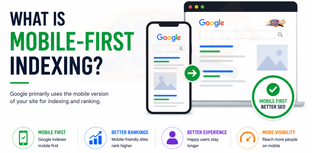
What Is Mobile-First Indexing?
What Is Mobile-First Indexing? Mobile-first indexing means Google mainly uses the mobile version of your website for indexing and ranking. In simple words, Google looks at how your website works on a phone before deciding how to understand and rank your pages. This is very important because many people use mobile phones to search, read, shop, and contact businesses online.
If your website looks good on desktop but works poorly on mobile, your SEO can suffer. Google says it uses the mobile version of a site’s content, crawled with the smartphone agent, for indexing and ranking. This is called mobile-first indexing.
At Topseolinks.com, we help businesses make their websites mobile-friendly, fast, easy to use, and ready for better SEO performance.
Want expert SEO support for your website? Start with our special offer: Free SEO for 1st Month
Why Mobile-First Indexing Matters
Mobile-first indexing matters because Google wants to understand your website the way most users see it. Today, many people open websites on mobile phones. They search for services, read blogs, compare products, check prices, fill out forms, and make purchases from their phones.
If your mobile website is slow, difficult to read, missing content, or hard to use, visitors may leave quickly. Search engines may also have trouble understanding your page properly.
Mobile-first indexing matters because it affects:
- How Google reads your content
- How Google understands your images and videos
- How your pages may appear in search results
- How mobile users experience your website
- How search engines crawl and index your pages
- How strong your SEO foundation becomes
A mobile-friendly website is not only good for search engines. It is also good for real people. If users can easily read your content, click buttons, open menus, and contact you from a phone, your website has a better chance to bring leads and sales.
How Mobile-First Indexing Works
Mobile-first indexing works by using the mobile version of your website as the main version for Google’s indexing and ranking systems.
Think of your website like a school notebook. If your desktop site is one notebook and your mobile site is another notebook, Google mostly checks the mobile notebook first. If the mobile notebook is missing pages, has unclear writing, or hides important answers, Google may not understand your website fully.
Here is the simple process:
- Googlebot Smartphone visits your website.
- It checks the mobile version of your page.
- It reads your text, links, images, videos, metadata, and structured data.
- It uses the mobile version to understand your page.
- It stores and ranks the page based mostly on what it finds on mobile.
This means your mobile page should not be a weaker version of your desktop page. Google recommends making sure your mobile content is the same as your desktop content because indexing comes from the mobile site.
Mobile-First Indexing Is Not the Same as Mobile-Friendly Design
Many people think mobile-first indexing and mobile-friendly design are the same thing. They are related, but they are not exactly the same.
Mobile-friendly design means your website is easy to use on a phone.
Mobile-first indexing means Google mainly uses the mobile version of your website for indexing and ranking.
A website can be mobile-friendly but still have mobile-first indexing problems. For example, your mobile page may look nice, but it may hide some important content that appears on desktop. That can still hurt SEO.
| Topic | Simple Meaning | Why It Matters |
|---|---|---|
| Mobile-friendly design | Your website works well on phones | Helps users read, click, and browse easily |
| Mobile-first indexing | Google mainly uses the mobile version for indexing and ranking | Helps Google understand your website correctly |
| Responsive design | One website layout adjusts to all screen sizes | Makes mobile and desktop content easier to manage |
| Mobile SEO | SEO work focused on mobile users and mobile search | Helps improve mobile search visibility |
| Page speed | How fast your page loads on mobile and desktop | Helps users stay and browse smoothly |
Why Google Uses Mobile-First Indexing
Google uses mobile-first indexing because mobile usage has grown a lot. Many users now search from phones instead of desktop computers. So, Google wants to make sure search results are useful for mobile users.
If Google only checked the desktop version, it might miss problems that mobile users face. For example, a page may look perfect on desktop but be hard to use on a phone.
Mobile users may face problems like:
- Text is too small
- Buttons are too close
- Images are too large
- Pages load slowly
- Menus are hard to open
- Forms are difficult to fill
- Content is hidden
- Popups cover the screen
- Videos do not play properly
- Internal links are hard to click
Mobile-first indexing helps Google understand whether the mobile version of your page is useful and complete.
What Google Checks on the Mobile Version
Google looks at many things when crawling your mobile website. Your mobile page should give the same useful information as your desktop page.
1. Content
Your mobile page should include the same important content as your desktop page.
This includes:
- Main headings
- Paragraph text
- Product details
- Service information
- FAQs
- Pricing details if shown on desktop
- Reviews if important
- Internal links
- Calls to action
- Important images and videos
If your desktop page has helpful content but your mobile page hides or removes it, Google may not see the full value of your page.
2. Metadata
Metadata helps search engines understand your page. Your mobile and desktop versions should have the same important metadata.
This includes:
- Title tag
- Meta description
- Robots meta tags
- Canonical tags
- Structured data
- Hreflang if used
If metadata is different on mobile, search engines may get confused.
3. Images and Videos
Images and videos should work properly on mobile. Google recommends making sure images and videos on mobile follow best practices and that mobile content quality is as good as desktop.
Make sure mobile images:
- Are clear
- Are not too small
- Have useful alt text
- Load properly
- Use supported formats
- Do not block important content
- Match the purpose of the page
Make sure videos:
- Play correctly on mobile
- Are not too large
- Have proper placement
- Do not hide text
- Do not slow the page too much
4. Internal Links
Internal links help users and search engines move through your website. Your mobile version should include important internal links, just like desktop.
If desktop pages have useful internal links but mobile pages remove them, Google may not find important pages easily.
Internal linking is also important for website structure and SEO.
5. Structured Data
Structured data helps search engines understand special page information, such as products, reviews, FAQs, articles, breadcrumbs, and business details.
If your desktop page has structured data, your mobile version should also have matching structured data.
6. Page Speed
Mobile users often browse on slower networks. If your mobile page is slow, users may leave. Mobile speed also affects user experience and page performance.
For better performance learning, you can read How Page Speed Affects SEO
Common Mobile-First Indexing Problems
Mobile-first indexing problems usually happen when the mobile website is different from the desktop website. These differences can make Google understand less information from your page.
| Problem | What Happens | SEO Risk | Best Fix |
|---|---|---|---|
| Mobile page has less content | Google sees less information than desktop | Rankings may drop for important keywords | Keep important content the same on mobile |
| Mobile page loads slowly | Users wait too long | Higher exits and poor experience | Improve speed and images |
| Mobile images are missing | Google may not understand visual content | Lower image and page quality | Use clear mobile images |
| Mobile links are missing | Google may miss important pages | Weak crawling and internal linking | Keep key links on mobile |
| Different metadata | Google gets mixed signals | Indexing and ranking confusion | Match metadata across versions |
| Popups cover content | Users cannot read easily | Poor mobile experience | Use smaller, user-friendly popups |
| Buttons are hard to tap | Visitors struggle to use the page | Lower engagement and conversions | Improve mobile design |
| Blocked resources | Google cannot render the page properly | Page may be misunderstood | Allow Google to crawl important files |
Mobile-First Indexing and SEO
Mobile-first indexing affects SEO because Google uses the mobile version to understand your website. If your mobile page is complete, fast, and easy to use, it supports your SEO. If your mobile page is weak, it can reduce your website’s search performance.
Mobile-first indexing affects SEO in these ways:
Content Visibility
If important content is missing from mobile, Google may not use it for indexing. This can reduce your chance of ranking for important keywords.
For example, if your desktop page has a detailed service explanation but your mobile page only shows a short version, Google may only see the short version.
User Experience
Mobile users should be able to read, click, scroll, and contact you easily. If the mobile page is difficult, users may leave.
Better mobile experience can help:
- More people stay on your website
- More users read your content
- More visitors fill forms
- More buyers complete purchases
- More users trust your business
Crawling and Indexing
Google needs to crawl your mobile pages properly. If your mobile version blocks important resources, hides links, or uses incorrect tags, indexing can suffer.
For a related technical topic, you can read What is Technical SEO
Conversion Rate
A good mobile page can bring more leads and sales. People often search on mobile when they want quick answers. If your site loads fast and is easy to use, they are more likely to take action.
Best Practices for Mobile-First Indexing
Mobile-first indexing best practices help your website stay ready for Google and users.
1. Use Responsive Web Design
Responsive design means one website automatically adjusts to different screen sizes.
This is usually the easiest setup because you manage one version of the website instead of separate desktop and mobile versions.
Responsive design helps because:
- Content stays consistent
- URLs stay the same
- Internal links stay easier to manage
- Metadata is easier to control
- Google can crawl the website more easily
- Users get a better experience on different devices
2. Keep Content the Same on Mobile and Desktop
Your mobile page should include the same important information as desktop.
This does not mean the design must look exactly the same. Mobile design can use accordions, tabs, or shorter visual layouts. But the important content should still be available.
Google says mobile pages can use different design patterns like accordions or tabs, but the content should be equivalent because indexing comes from the mobile site.
3. Make Text Easy to Read
Mobile text should be clear and readable.
Good mobile text should have:
- Enough font size
- Short paragraphs
- Clear headings
- Good spacing
- Simple words
- Easy scrolling
- No tiny text
- No content squeezed together
If users must zoom in to read, the page is not user-friendly.
4. Make Buttons Easy to Tap
Mobile users use fingers, not a mouse. Buttons and links should be easy to tap.
Make sure:
- Buttons are large enough
- Links are not too close together
- Menus open smoothly
- Forms are easy to fill
- Important CTAs are visible
- Clickable areas are not tiny
5. Improve Mobile Page Speed
Mobile pages should load quickly.
To improve speed:
- Compress images
- Use caching
- Reduce heavy scripts
- Avoid large sliders
- Use lightweight design
- Improve hosting
- Remove unused plugins
- Optimize fonts
- Reduce popups
A fast mobile page helps users stay longer and take action.
6. Avoid Blocking Important Resources
Google needs to access important files to understand your mobile page.
Do not block important:
- CSS files
- JavaScript files
- Image files
- Mobile layout files
- Important page resources
Google recommends allowing Google to crawl resources because blocked resources can affect rendering and indexing.
7. Use the Same Metadata
Make sure mobile and desktop versions have the same SEO signals.
Check:
- Title tag
- Meta description
- Canonical tag
- Robots tag
- Structured data
- Hreflang
- Open Graph tags where needed
Different metadata can confuse search engines.
Mobile-First Indexing Checklist
| Task | Why It Matters | Priority |
|---|---|---|
| Use responsive design | Keeps mobile and desktop content consistent | High |
| Keep same main content | Helps Google understand the full page | High |
| Match metadata | Avoids mixed SEO signals | High |
| Improve mobile speed | Helps users stay and browse smoothly | High |
| Make text readable | Improves mobile user experience | High |
| Make buttons easy to tap | Helps users take action | High |
| Keep internal links visible | Helps crawling and page discovery | Medium |
| Optimize images | Improves speed and visual quality | High |
| Check structured data | Helps search engines understand page details | Medium |
| Avoid blocking resources | Helps Google render the page | High |
| Test mobile pages regularly | Finds problems early | High |
How to Check If Your Website Is Ready for Mobile-First Indexing
You should not guess whether your website is ready. You should check important pages and compare the mobile version with the desktop version.
1. Check Important Pages
Start with pages that matter most:
- Homepage
- Service pages
- Product pages
- Category pages
- Contact page
- Blog posts
- Landing pages
- Pricing page
- Checkout page
These pages usually bring traffic, leads, or sales.
2. Compare Mobile and Desktop Content
Open the same page on desktop and mobile. Check if the important content is available on both.
Look for:
- Missing sections
- Missing FAQs
- Missing images
- Missing product details
- Missing internal links
- Missing reviews
- Different headings
- Different metadata
- Hidden content that needs clicks to load
Content can be arranged differently on mobile, but important information should not disappear.
3. Use Google Search Console
Google Search Console helps you inspect URLs and check indexing issues. It can help you understand how Google sees your pages.
Use it to check:
- Whether URLs are indexed
- Whether pages have crawl issues
- Whether mobile pages are accessible
- Whether Google can render pages
- Whether there are indexing problems
4. Test Mobile Page Speed
Mobile speed is a big part of mobile experience.
Check:
- How fast the main content loads
- Whether images are too large
- Whether scripts delay loading
- Whether buttons respond quickly
- Whether layout shifts happen
- Whether mobile users can complete actions easily
Mobile-First Indexing for Business Websites
Business websites need mobile-first indexing readiness because many customers search from phones.
A customer may search for:
- SEO services
- Web design company
- Local business services
- Contact details
- Pricing
- Reviews
- Business location
- Service details
If your mobile site is slow or incomplete, you may lose leads.
Important business pages to optimize:
- Homepage
- Main service pages
- About page
- Contact page
- Pricing page
- Location pages
- Blog posts
- Landing pages
Topseolinks.com helps businesses improve mobile SEO through Expert SEO Services, website audits, technical SEO checks, content improvement, and performance planning.
Mobile-First Indexing for Ecommerce Websites
Ecommerce websites need strong mobile performance because many shoppers browse and buy from phones.
Important ecommerce mobile pages include:
- Homepage
- Product pages
- Category pages
- Cart page
- Checkout page
- Search pages
- Filter pages
- Offer pages
A mobile ecommerce page should show:
- Product title
- Product images
- Price
- Description
- Reviews
- Delivery details
- Return details
- Add to cart button
- Related products
- FAQs
If these details are missing from mobile, Google and users may not understand the page properly.
Ecommerce mobile problems include:
- Slow product images
- Hard-to-use filters
- Small buttons
- Long checkout process
- Hidden product details
- Missing reviews
- Poor mobile navigation
- Heavy scripts
Fixing these issues can improve both SEO and sales.
Web Design and Mobile-First Indexing
Web design plays a big role in mobile-first indexing. A website should look clean and work well on every screen size.
A good mobile design should be:
- Fast
- Simple
- Easy to read
- Easy to scroll
- Easy to tap
- Clear in structure
- Friendly for forms
- Light in design
- Consistent with desktop content
Bad mobile design can create problems like:
- Hidden content
- Tiny text
- Cut-off images
- Overlapping buttons
- Slow loading
- Hard navigation
- Popups covering the screen
- Forms that are hard to submit
Topseolinks.com provides Web Design support that focuses on mobile-friendly layouts, clean structure, faster pages, and SEO-friendly user experience.
Common Mobile-First Indexing Mistakes
Mobile-first indexing mistakes can hurt your SEO because Google may not see the same content or signals on mobile.
Hiding Important Content on Mobile : Some websites remove content from mobile to make the page shorter. This can be risky if the removed content is important for SEO. Instead of removing content, organize it better with clear sections, tabs, or accordions.
Blocking CSS or JavaScript : If Google cannot access important files, it may not render the mobile page correctly. This can make the page look incomplete to Google.
Using Different Metadata : Different mobile and desktop title tags, meta descriptions, canonical tags, or robots tags can confuse search engines.
Slow Mobile Pages : Slow mobile pages can make users leave quickly. They also create a poor page experience.
Poor Mobile Navigation : If the menu is hard to use, users and search engines may struggle to find important pages.
Small Buttons and Text : Tiny buttons and small text make mobile browsing difficult. Users should not need to zoom in.
Popups Covering Content : Large popups can block the page on mobile. This makes users frustrated and can hurt experience.
Missing Structured Data : If structured data exists on desktop but not mobile, search engines may miss useful information.
How Topseolinks.com Helps With Mobile-First Indexing
Mobile-first indexing can feel technical, but Topseolinks.com makes it easier for business owners.
We check your website from the mobile user’s view and the search engine’s view.
1. We Audit Your Mobile Website
We review mobile pages, mobile speed, content visibility, metadata, structured data, links, images, design, and technical SEO issues.
2. We Compare Mobile and Desktop Pages
We check whether your mobile version includes the same important content as desktop.
This helps avoid missing content problems.
3. We Improve Mobile SEO
We optimize important pages so they are easier for Google and users to understand.
This can include:
- Mobile content checks
- Technical SEO fixes
- Speed improvements
- Internal link improvements
- Image optimization
- Metadata checks
- Structured data review
- Mobile design improvements
4. We Improve User Experience
Good SEO is not only about search engines. Users should also enjoy using your website.
We help make your mobile website easier to read, click, scroll, and contact.
5. We Help Keep Your Website Ready
Websites change over time. New pages, plugins, scripts, images, and design updates can create new mobile issues.
Topseolinks.com helps businesses monitor and improve mobile SEO regularly.
Make Your Website Ready for Mobile Search
Mobile-first indexing means Google mainly uses the mobile version of your website to understand and rank your pages. This makes your mobile website very important for SEO.
Your mobile website should have the same important content, metadata, links, images, and structured data as your desktop website. It should also load quickly, look clean, and be easy to use.
The main things to remember are:
- Keep mobile and desktop content equal
- Use responsive design when possible
- Make pages fast on mobile
- Keep text easy to read
- Make buttons easy to tap
- Avoid hiding important content
- Allow Google to crawl important files
- Match metadata and structured data
- Test important pages regularly
At Topseolinks.com, we help businesses improve mobile-first indexing readiness, technical SEO, mobile design, page speed, and user experience. Our goal is to make your website easier for Google and better for users.
Ready to improve your mobile SEO and website performance? Contact Us
FAQs
What is mobile-first indexing?
Mobile-first indexing means Google mainly uses the mobile version of your website for indexing and ranking. This means your mobile page is very important for how Google understands your website.
Why is mobile-first indexing important for SEO?
Mobile-first indexing is important because Google checks the mobile version of your website first. If your mobile site is slow, incomplete, or hard to use, your SEO performance may suffer.
Does mobile-first indexing mean desktop does not matter?
No, desktop still matters for users, but Google mainly uses the mobile version for indexing and ranking. Your website should work well on both mobile and desktop.
What is the best website design for mobile-first indexing?
Responsive design is usually best because one website adjusts to different screen sizes. It helps keep content, links, metadata, and SEO signals consistent across devices.
Can hidden mobile content hurt SEO?
Yes, hidden or missing mobile content can hurt SEO if important information is not available to Google. Content can be organized differently on mobile, but important content should still be present.
How can I make my website ready for mobile-first indexing?
You can make your website ready by using responsive design, keeping mobile and desktop content the same, improving mobile speed, matching metadata, optimizing images, keeping links visible, and testing pages regularly.
Is mobile page speed important for mobile-first indexing?
Yes, mobile page speed is important because slow pages create poor user experience. Fast mobile pages help visitors stay, read, click, and take action.
Can Topseolinks.com help with mobile-first indexing?
Yes. Topseolinks.com can audit your mobile website, compare mobile and desktop content, fix technical SEO issues, improve mobile speed, optimize design, and help your website perform better in mobile search.